Paul Heaston

Composing Drawings While on Location

Paul Heaston
Duration:   9  mins

Description

Explore ways to use a viewfinder and your imagination to create a unique and compelling composition for each sketch. Sketch artist Paul Heaston shares important considerations for your location and field of view, as well as valuable composition tips that can transform a seemingly simple sketch into a dynamic work of art. Work with horizontal, vertical, cropped, and panoramic scenes as you create thumbnails to take each composition for a test drive and get Paul’s top tips for things to consider when composing a scene.

Share tips, start a discussion or ask other students a question. If you have a question for the instructor, please click here.

Make a comment:
characters remaining

3 Responses to “Composing Drawings While on Location”

  1. Zoie McIntyre

    Wow Paul - this is perfect. I love the viewfinder and I will definitely make myself one. My sketchs still pretty much look like a 2 year old did them, but I am told that practice will improve that ;)

  2. Richard O Jones

    Looking at a photograph is not cheating

  3. Eman Elkholy

    Amazing! This is the video I was looking for! Thank you a lot

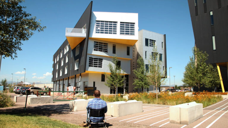
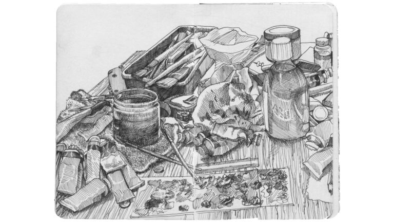
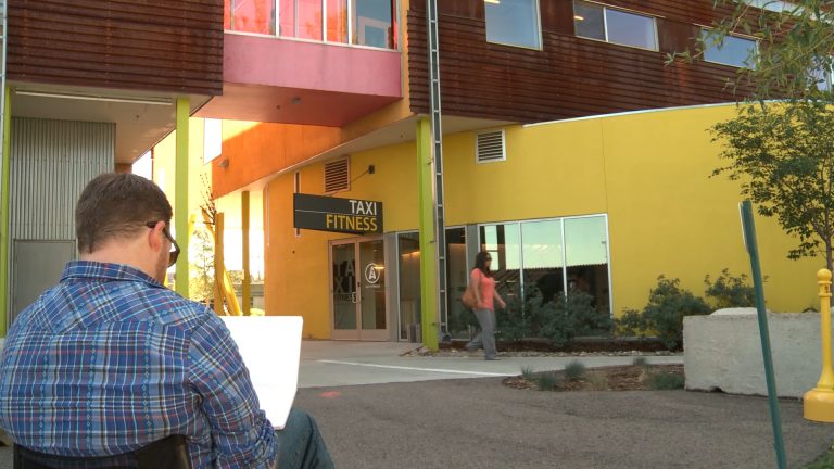
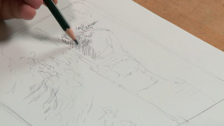
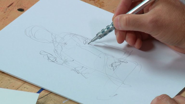
So once you've got yourself into a great spot to sketch, it's time to decide how you want to approach your scene. In this lesson, you'll be considering space and scaling your sketch, using a viewfinder to try out compositions, and making thumbnails to refine your compositional choices. So let's start by talking about your field of view. So I found a nice modern building, not too complicated, but visually interesting, that I decided to sketch, and when you approach a sketch like this, it's important to think about your field of view and your cone of vision. So your field of view is roughly how much you can see, basically your world without turning your head. It's about 180 degrees side to side, and it's about 135 degrees up and down. So when you're approaching a building, it's important to think, how much of my field of view do I want the building to take up? How much of this building do I want to see? Do I want to think about maybe the space between me and this building later on when I make some more compositional choices? Do I want to make it fill that frame, fill my field of view, by getting really close, or do I want to lend some context to where I found this building, what the environment is like, what's next to it, what's below it, what's above it? How much am I going to include in the frame, basically? So a little bit more about that cone of vision or your field of view. Remember, the closer you get to something, the more it's going to fill up that field of view and it's going to get very close to the edges of your cone of vision, and the further away, the less it's going to fill up. What I mean by that is something that's far away isn't going to change very much if you get, say, 10 or 15 feet closer to it. However, something that's already very close to you is going to get exponentially larger as you get a few feet closer. So if you're already looking up at a building and you walk a few feet closer, it's going to grow until it encompasses and possibly exceeds your entire field of view. One great tool for developing a composition in terms of your field of view is a viewfinder, and we're going to talk about that next. Now, if you've never used a viewfinder before, you can definitely pick them up in an art supply store, or you can make your own, I think that's a lot easier. The simplest viewfinder is one you can make with your hands. You can just hold your fingers up to your composition. But if you want something that's a little bit cleaner and a little bit easier to sort of determine a composition, making one out of cardstock or matte board is really easy. So this is a simple matte board viewfinder that I made, and the great thing about it is that if you've got, say, a sticky note or something like that, you can actually change the aspect ratio on that as you're holding it up to your field of view. And what's great about that is you can basically, when you're looking at it through a viewfinder, you don't want to look right in dead center and then work your way out. You want to look at where the edges of the viewfinder are intersecting your scene, and that's going to help you determine what composition you're going to generate. So look at where the edges of the viewfinder are meeting elements in your field of view, like, oh, the right edge maybe intersects the side of this building right over here, maybe three quarters of the way down, and the top is, oh, I don't know, about a building's length above the top of the building, and then, oh, the left side of the viewfinder meets this tree over here. So those are the things you really want to look at when using a viewfinder. A lot of people still tend to do the center out approach even though they're looking through a viewfinder, but really, the only important elements of the viewfinder are the edges. So at this point, you might be wondering, well, once I've established my composition, what I'm going to sketch today, why don't I just take a picture with my camera phone and take it home and draw it there? Well, that kind of runs counter to the whole ethos of urban sketching or sketching on location. Now remember, your sketchbook is portable, and my philosophy of course, is that you're going to get a much more vibrant, dynamic sketch if you do everything on location, and that's what I try to do whenever possible. So with that in mind, one of the great things about that viewfinder is that you can use that as a way to set up a couple of different compositional choices and then you can make thumbnails of those compositional choices to help you kind of distill that information a little bit better and see clearly maybe what your finished sketch is going to look like. So here you'll see I did a standard landscape format. I think this is the one that we sort of default to in our brains when we're picturing a landscape, be it an urban landscape or maybe a natural landscape. We tend to think, oh, everything's got to be horizontal and we'll just lay it in there. But as an alternative, you might consider a portrait format. The reason being, look at the information that the portrait format can give you. You get a lot more in terms of context about the distance between the viewer and the subject. Look at all of this, you know, information here, and also, you can include other elements like atmospherics, like clouds in the sky or a bright, blue, sunshiny day. So there's definitely a lot more available to you in an alternate format like a portrait. If you've got a specialty like a panoramic sketchbook or something like that, panorama is definitely another option. That, or you can simply crop a regular, rectangular sketchbook page, just to include sort of this panoramic type format there. And speaking of cropping, of course, you're not required to put the whole thing into your field of view, you can pick and choose, and that's another advantage of thumbnailing, is it can help you determine maybe what visual elements you want to include and what you want to exclude, and so a cropped format might be the perfect sketch for you. Speaking of choosing what you want to include and what you don't want to include, another advantage of thumbnailing is it kind of helps you distill all that visual information. It helps you condense it into sort of an economized version of what you're seeing, and that's really important when sketching because, depending on how much time you've allotted yourself for sketching, or, you know, how much you think you can take on in a given amount of time, you may or may not want to include all of the details that you can see with your naked eye. In fact, taking on too much detail and being a little bit too ambitious with a sketch can be problematic. I'll show you some examples here. Here's a sketch that I did where I kind of, I focused in on the detail of this tractor or this backhoe tire before I'd really established the general composition, and so I kind of got carried away with what was going on right here in the center, and then as I worked my way out, I realized I didn't have a particularly interesting composition or really anywhere to go. Another problem with, of course, being too detailed is you really run out of time to sketch. So I really had a nice vantage point from a really tall building, and I wanted to include this huge cityscape, lots of buildings, lots of windows, and it's pretty ambitious, and realizing that I didn't have a lot of time and, you know, a limited amount of time, you really can't quite pull off, maybe, all of that architectural detail. Of course, if you do have time, and you're deliberate, and you're careful about planning your composition, you can do a really, really detailed composition and pull it off effectively. And you can see this little coffee shop here, the nice thing about coffee shops, as I said before, nobody's going to kick you out, especially if you're polite enough to at least purchase a coffee before sitting down, and other people in the composition sit relatively still. That kind of goes back to the idea of sketching things that could potentially move. In a coffee shop, most people are plugged into their laptop, so despite the high amounts of caffeine in their bloodstream, they're probably pretty sedate. So when I was looking at this modern office building, there are a few detail elements that I wasn't really interested in, including, for instance, the reflections in the glass on the building, or maybe the gas meter on the side of the building, the drain pipes, I felt like they kind of blended into some of the other architectural elements anyway, and I didn't need to call attention to them in a sketch, but some of the more important elements that I saw that I did want to include were the road closed sig, and the stop sign and also the details on the windows, and of course it's really nice to at least take one good look at some of the repeated architectural elements in the building, like a window or a doorframe, because if you do find yourself running out of time to complete a sketch and you've got those architectural details in hand, when you take it home, you can repeat them without cheating and looking at a photograph. But in the end, remember, it's your sketchbook, and it's your world you're choosing to draw. So whatever you choose to include or not include is up to you. If you find certain elements of the building visually appealing or dynamic, or you would prefer maybe to draw the landscape in front of the building, you're into the flowers and you're into the trees, go for it. Really, your sketchbook is sort of a censorship free zone, and what you think is important to tackle, I think, is the most important thing you can take away here. Now, looking again at these thumbnails, I want to remind you that the good thing about thumbnails is that you can really try out and see what works and what doesn't work, and you can throw away ideas that you don't think panned out, and that's the advantage of doing a thumbnail before you do a finished sketch. If you, for instance, are much more attracted to that portrait idea, but you think the panorama just really didn't play, you haven't really committed to a full sketch, you've only done a thumbnail. I decided when I was doing these thumbnails that I really liked that portrait format the most, and so I determined that that's the way I wanted to move forward in my final sketch.
Get exclusive premium content! Sign up for a membership now!