Gouache Paint: The Colors
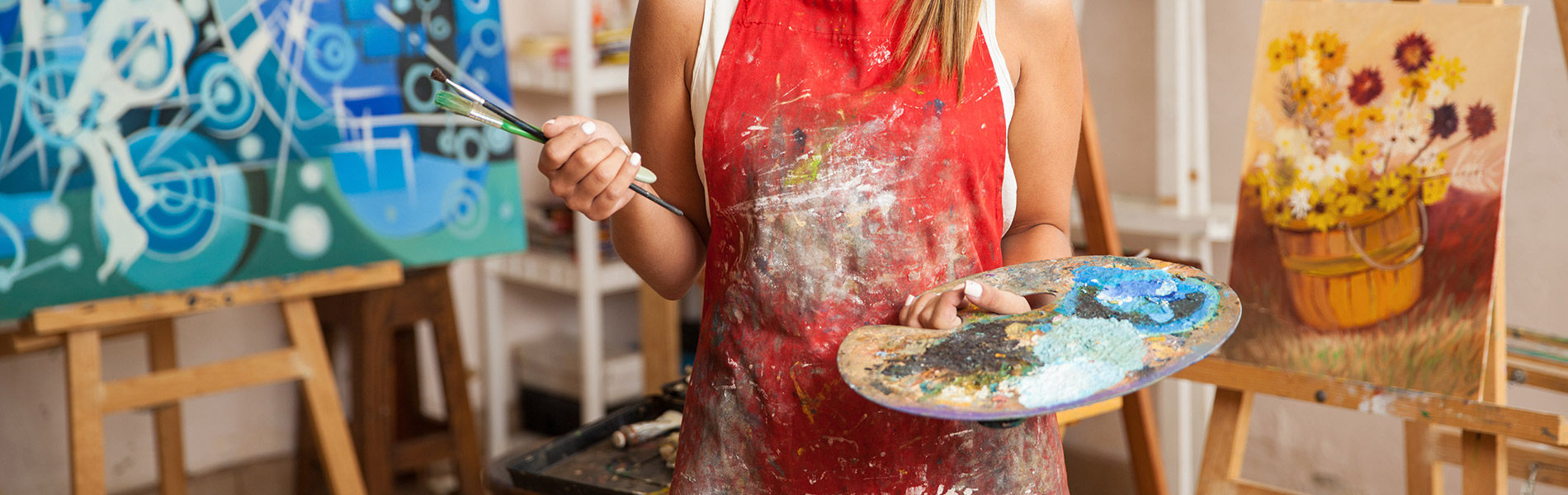
Stuart LoughridgeDid you know that the word “gouache” comes from the Italian word for “puddle”. That etymology helps Stuart Loughridge remember to keep his paintings loose when painting with gouache on cardboard because it will get puddly and drippy, so the less he tries to overly control it the better the experience overall.
For the first couple passes Stuart likes to use a muted red and yellow, and black as the primary colors that will serve to mix all of his secondary colors, too. Then he adds a cool gray and warm brown to the palette to have a warm and cool neutral. Now, when he needs more punches of color as the painting builds up he’ll reach for a cadmium red and yellow, and ultramarine blue- again, using the primary colors to mix the secondary ones. Titanium white is a staple for gouache painting, but there are other options for white that Stuart discusses as well for when a brighter passage is needed.
Because gouache is not transparent Stuart likes to keep some watercolor pigments on hand to put down some quick washes that act as glazes over the piece. They’re not always needed, but do offer some options for layering and depth that would otherwise not be possible with gouache.
There are also mediums that can be used in gouache to increase the flow a bit that you might want to keep in mind as an option when the paint is not coming off of the brush as you would like.
All of these pigments and medium, if you choose, will get you on your way to creating a beautiful, quick painting.
Share tips, start a discussion or ask other students a question. If you have a question for an expert, please click here.
Already a member?
One Response to “Gouache Paint: The Colors”
Let's talk about the pigments that I use when I'm painting in gush on cardboard. I want to point out first, um something fun is that the, the word comes from the Italian word Guzzo, which literally translates to puddle. I like to keep that in mind when I'm painting gosh on cardboard because it just helps me loosen up. And to remember that these are puddles of color, the water needs to have uh do what it does, which is pool around and drip and be playful. So to me, this is a playful medium.
It's about having fun. So let's talk about the pigments here. What I'd like to start with is a neutral primary set. This could be a variety of pigments and by pigment, I mean color. So let's go with Venetian red as a muted red.
I'm not taking a red that's strong yet, I'm just taking a, a muted red and Venetian red is a good start. Other reds will do that are uh more towards the center of the color wheel, but these aren't colors that are on the outside of the color wheel. The muted yellow, easy yellow, ochre, a common pigment fun to use. It can mix a green but it's not gonna mix a strong green and ivory black for the cool, the ivory black is a cool black one mixed with blue and put onto the cardboard. The brown base of the cardboard, it will even appear a bit blue.
Of course, it won't appear so blue. When you mix actual blue pigment with white and put it up against that, it will look much more gray, but standing alone, it will appear as blue. I also like having on my palette a a cool gray and well, more of like a cool brown and a warm brown. So I have here a natural gray, I think I got it on sale. Um I'm not specific about the colors I use just as long as I have a certain spectrum in mind.
So that's a cool gray and here's a uh a warm gray or a warm brown Van Dyke Brown. It's handy to use. I might not even use them in this, but I like to have them on hand. Um It's, it's a warm and a cool essentially. Then I jump into my stronger primaries we went through just now the muted primaries.
So now I have the stronger primaries. So I have a cadmium red pigment and this again is towards the outside of the color wheel and I have an ultramarine blue pigment. You can use Cobalt blue as well. I would try to stay towards ultramarine blue or cobalt blue. You could go towards prussian or low, but it takes a bit more practice to handle those really strong blues.
Ultramarine blue is a safe blue as is cobalt and then a cadmium yellow again, a really strong yellow, pretty much as strong as you can get outside of the color wheel on the edge of the color wheel. And so you can push those greens if you want or any of the strong yellows say there's flowers in your paintings that these three primaries should be able to handle. Most of what you throw at the image for whites have a variety of whites here. The most common white in painting is Titanium white. If you're unsure what white you have in your set of paints, there should be a little label on the back with a number.
Titanium is PW six. If you see PW six in there, that is a Titanium white. Titanium white is the most commonly used. Gosh, I also have a large tube of it here so I can really go to town with it and not hold back. It's nice to have the large tube and then I also have zinc white, which is P W-4.
So keep that in mind. Zinc white does well. The pigment, zinc does well when mixed with water and it's a brighter white than Titanium. It it keeps brighter. So it's nice to have a bit more of a punch when you need it.
And then I also have my, I always have this on my palette when I'm painting in water based paints is my Doctor Martin's bleed proof white. It is P W-4 sink white and I'm not exactly sure what the binder is, but it is so bright. It's, it, it stays brighter than the paints. Gosh, darkens as it dries. So that's the thing that's kind of the learning curve to, to, to, to, to get used to with gush.
Um This Doctor Ph Martin's white stays bright and it also can mix with any of the paints, it can mix with water colors as well. And then um I do like to have some transparent colors on hand, whatever water colors you have on hand that are into the primaries and some of the browns, it's nice to have some transparent options. Again, gosh is not transparent. Gosh has calcium carbonate in it. Uh The the pigments are ground to a larger size.
They're not ground as fine as water color. So they're just, it's, it's a bulkier paint. It is opaque water color is transparent and I like to have a few transparent uh choices on hand. It could be really anything in the yellows, reds or blues, uh but just some transparency here, I have a transparent ochre. Um and I can just glaze this over the painting if I need a little more warmth, it just is a wonderful transparent wash.
I also have a, if I need to just darken things, uh throw a transparent wash of brown over, I have some sepia, I generally will put these out on the pallet only if I really need them. I don't put them out on the pallet at the beginning. What I do at the beginning is I just start with my three muted primaries here, the black uh the muted red, in this case, the English red and the yellow ochre. These are the three that I like to start with. And of course, the white as well.
If I start here, then I'll start realizing which direction I want to go and I'll put the other pigments out on the palette as I need them. But to start as simple as possible is the goal here because you're using a real basic substrate and it's good to keep the paints at a really basic level. And then before you paint, uh it's good to know that you don't need to prepare the cardboard in any way, put the cardboard up on the table or the easel or on the floor and just dive right in. If you feel like perhaps the paint is not flowing as well as you want. You can introduce Ox Gal.
It increases the flow of the paint and it slows the dry time just to touch as well. I'm not going to use it in the demo here. I just want to show the real bare bone way of handling. Gosh, but it's an option. Something to keep in mind if you, if you come across a cheap bottle of ox G or if some artist is selling some supplies, then you can have it in mind that CAL can be of use with.
Gosh, it can definitely increase the flow. So that covers the pigments that I'll be using to paint on cardboard. Thank you.
What kind of cardboard is he using that requires “no preparation”?