
Choosing a Color Palette for Floral Illustration
Mia Whittemore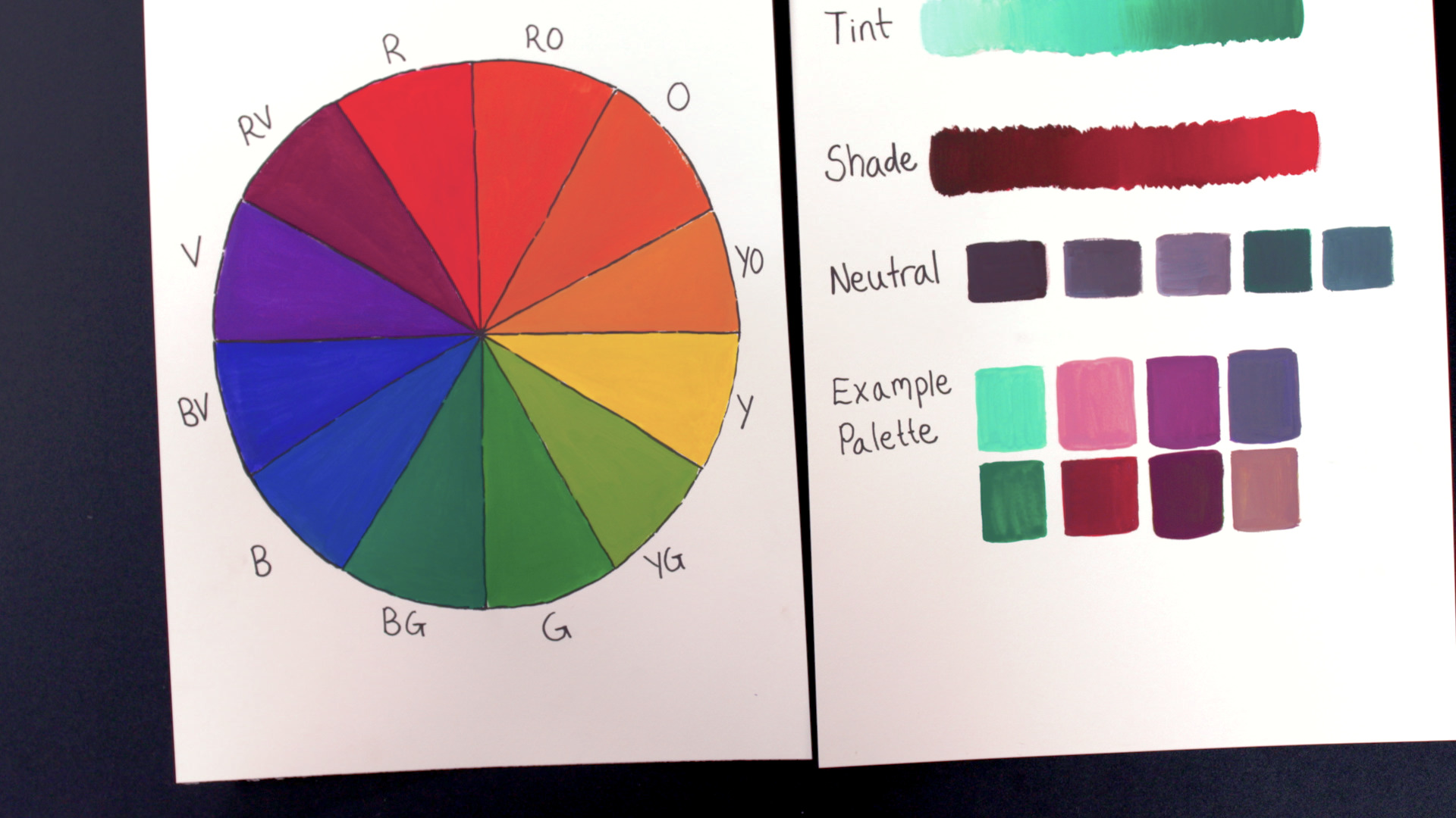
Video Player is loading.
When it comes to choosing a floral color palette, the color wheel is a great place to get information about how colors work together, says artist Mia Whittemore. The color wheel is anchored by the three primary colors: red, yellow, and blue. Mix any two of those primary colors together to get the secondary colors. Red and yellow make orange, yellow and blue make green, and blue and red make violet. Between a primary and its secondary color is an intermediate, or tertiary, color. For example, red-orange sites between red (primary) and orange (secondary). You also have yellow-orange, yellow-green, blue-green, blue-violet, and red-violet. These 12 colors—three primary, three secondary, and six tertiary—are evenly spaced as wedges around the wheel.
The color wheel can be divided up between warm and cool colors. Warm colors (red through oranges to yellow-green) are vibrant and active while cool colors (green though blues to red violet) recede into the background, says Mia. Complementary colors are directly opposite from one another on the color wheel and often look good together because they offer so much contrast between them. However, be aware that complementary colors can be bright and strong, says Mia. Analogous colors are next to one another on the wheel. For example, red-violet, red, and red-orange are all near each other on the color wheel. These colors are similar, but different enough to add subtle contrast.
The color wheel is expanded when you add tints, shades, and neutrals to each color. To create a tint of any color you just simply add white to it to lighten it up. A shade is the opposite: you add black to a color, making it darker. Neutrals—white, browns, and grays—are more subdued colors that give the eye a rest when worked near brighter colors.
There is no right or wrong way to use colors, says Mia, but the color wheel is a tool to help you get started experimenting until you know what colors and combinations you like.
Hi. I'm Mia Whittemore, and in this lesson we're gonna be talking about choosing a color palette for floral illustration. So there's no right or wrong way to choose a color palette, but there are some things about color that are helpful to know for when you're choosing your palettes. So to start with, we look at our basic color wheel. So the color wheel has some information on it that will be really helpful for choosing pallets if you wanna use it.
So, our color wheel has, of course, our three primary colors, so red, yellow, and blue. Now it also has the secondary colors, so you get those by mixing together two primaries. So red and yellow make orange, blue and yellow make green, and then blue and red make violet. Now in between a primary and a secondary color, you have your intermediate color. Sometimes they're called tertiary colors.
So you have red-orange, you have yellow-orange, yellow-green, blue-green, blue-violet, and red-violet. So those 12 colors then have some more information that we can learn from the color wheel. So we can also divide the color wheel in half for warm and cool colors. So if I kind of took my color wheel like this, this half over here are reds, oranges, yellows, and kind of yellow-green. Those are our warmer colors.
So usually when you're painting, they kind of come forward a bit more. And then we also have our cool colors, so from red-violet all the way to green, and these colors tend to recede into the background a little bit more, which kind of makes sense because the warm colors are like a bit more vibrant, they're almost like brighter, they feel warmer, and the cool colors are a bit cooler so they go back a little bit deeper kinds of colors. So, when we're choosing colors for our color palette, we can think about maybe using complementary colors. So complementary colors are across from each other on the color wheel. So for example, red and green is a very well-known complementary color set, of course, because it's like holiday colors, and complementary colors complement each other because they're across, they're opposites on the color wheel, so it's like they're so different, they look good together because they have contrast.
So there's all different pairs of complementary colors that you could consider using if you wanted to, but they can be really bright and strong, so sometimes you can just test it out and see how you like it. So, we have our warm and cools, we have our complements, and we also have analogous colors. So analogous colors are colors that are next to each other on the color wheel. So for example, red-violet, and red, and red-orange is a set of analogous colors. Blue-green and green are analogous right next to each other under color wheel.
So that's something that can also be really pleasing in your color palette is to have analogous colors because they're similar, but they're still a bit different. So, from the information on the color wheel, we can also add in some knowledge of tints, shades, and neutrals. So tints, I use a lot in my artwork because I like pastel colors. So a tint is when you add white to a color. So I have this blue-green sort of color and I added white to it, so you can see some various tints that are made by adding white to a color.
And then for shade, you add black to a color. So I added black to this red, and you can see the variation of colors that you can get from adding black to a color. Now neutrals are things like white, browns, and grays. They're sort of more subdued colors and they can just be a really good complement because they're a fresh, like a break for the eye from some brighter colors. So in an example palette that I have, I took some knowledge of the color wheel.
So I have a blue-green sort of color, and I wanted something that would contrast with it, but not so much so like I would choose the complement. So for example, blue-green and red-orange are complements. I didn't wanna go that strong, so I moved over a little bit to the red, and because I knew that if I added white to my red, it would make a pinkish color, and I like to use pinks and pastel pinks in my work. So I have a cool sort of blue-green color, I have an almost opposite red color, and I also have a tint that I made by adding white to that reddish color so it makes a pink, and I also went and chose an analogous color to my red. I chose a red-violet, and I have the red-violet and also a shade that I made of that color too.
So you can just sort of play around a bit like okay, I wanna choose two or three colors, and then maybe I'll make a tint of this one and a shade of this one, and you create something until it feels pleasing to you. And then lastly, I chose some neutrals just to go in to add a break when I actually would do my final piece with this color palette. Maybe I would have some neutral colored leaves or maybe some flowers would be neutral color. It just gives the eye a break from brighter colors. So I hope this information is helpful for you for choosing a color palette for your floral illustration.
There's really no right or wrong way, but you can use the information in the color wheel and information about tints and shades and neutrals to help you out with choosing colors, and you really get better at it just by experimenting, and trying things out, and finding out which colors you like and which combinations that you like.
Share tips, start a discussion or ask other students a question. If you have a question for an expert, please click here.
Already a member? Sign in
No Responses to “Choosing a Color Palette for Floral Illustration”